CSS 面试题(山月)
如何实现一个元素的水平垂直居中
更多描述
要求对行内元素、块状元素及不定宽高的块状元素均可适用:
可打开 codepen 进行调试: https://codepen.io/shanyue/pen/XWMdabg(opens new window),以下是布局代码
<div class="container">
  <div class="item" style="width: 100px; height: 100px; background: #999;">
    块状元素
  </div>
</div>

<div class="container">
  <div class="item">不定高宽的块状元素</div>
</div>

<div class="container">
  <span class="item">行内元素</span>
</div>
.container {
  // 把代码写在这里
}

.container {
  height: 20rem;
  background: #ccc;
  margin: 1rem;
}
Issue
欢迎在 Gtihub Issue 中回答此问题: Issue 10(opens new window)
Author
绝对定位方法:
.box {
  postion: absolute;
  top: 50%;
  bottom: 50%;
  width: 50px;
  height: 50px;
  transform: translate(-50%, -50%);
}
<body>
<div class="box"><div>
</body>
flex 方法:
body {
    display: flex;
    justify-content: center;
    align-items: center;
}
.box {
  width: 50px;
  height: 50px;
}

<body>
<div class="box"><div>
</body>
Author
回答者: shfshanyue(opens new window)
提供一些现代浏览器下使用 flex/grid 的方法,不仅支持块状元素,而且支持行内元素,对固定高宽与不固定高宽皆可使用。
使用 flex,以下是经典的垂直居中。
.container {
  display: flex;
  justify-content: center;
  align-items: center;
}
使用 grid,它是做二维布局的,但是只有一个子元素时,一维布局与二维布局就一样了。
结合 justify-content/justify-items 和 align-content/align-items 就有四种方案
效果可以见 codepen(opens new window)
.container {
  display: grid;
  justify-content: center;
  align-content: center;
}
.container {
  display: grid;
  justify-content: center;
  align-items: center;
}
.container {
  display: grid;
  justify-items: center;
  align-content: center;
}
.container {
  display: grid;
  justify-items: center;
  align-items: center;
}
三个属性略显啰嗦,其实只需两个属性即可:
.container {
  display: grid;
  place-items: center;
}
.container {
  display: grid;
  place-content: center;
}
Author
回答者: SageSanyue(opens new window)
引自:https://css-tricks.com/centering-css-complete-guide/ 1 该元素的宽高固定吗? 在将元素绝对定位为 top: 50%; left: 50%;后,可以使用值为宽的一半和高的一半的负 margin 实现垂直水平居中。(跨浏览器支持很不错)
.parent {
  position: relative;
}

.child {
  width: 300px;
  height: 100px;
  padding: 20px;

  position: absolute;
  top: 50%;
  left: 50%;

  margin: -70px 0 0 -170px;
}
2 该元素宽高未知? (1)如果宽高未知,在将元素绝对定位为 top: 50%; left: 50%;后,可以使用 transform 属性来做负的 50%移动(基于当前元素宽高)。
.parent {
  position: relative;
}
.child {
  position: absolute;
  top: 50%;
  left: 50%;
  transform: translate(-50%, -50%);
}
(2)也可以元素相对父容器绝对定位(left: 0;right: 0;top: 0;bottom: 0;)并 margin: auto,不需要提前知道尺寸兼容性好。
.container {
  position: relative;
  height: 300px;
  border: 1px solid red;
}
.item {
  width: 100px;
  height: 50px;
  position: absolute;
  left: 0;
  top: 0;
  right: 0;
  bottom: 0;
  margin: auto;
  border: 1px solid green;
}
3 你要用 flexbox 吗? 对 flexbox 进行垂直水平居中,只需设置两个属性为 center: align-items、justify-content。
.parent {
  display: flex;
  justify-content: center;
  align-items: center;
}
4 你要用 grid 布局吗? 父容器设置为 grid 布局后,子元素直接 margin: auto;即可实现垂直水平居中。
body, html {
  height: 100%;
  display: grid;
}
span { /* thing to center */
  margin: auto;
}
详细案例解释可参考:https://zhuanlan.zhihu.com/p/87134477
Author
回答者: lastSeries(opens new window)
你不知道的 flex 布局~
.box {
  display: flex;
}

.item {
  margin: auto;
}
Author
回答者: shfshanyue(opens new window)
你不知道的 flex 布局~
``` .box { display: flex; }
.item { margin: auto; } ```
这个方法眼前一亮,试了一下: 行内元素与块状元素均可,学习了!
Author
回答者: babycannotsay(opens new window)
你不知道的 flex 布局~
``` .box { display: flex; }
.item { margin: auto; } ```
这个方法眼前一亮,试了一下: 行内元素与块状元素均可,学习了!
https://css-tricks.com/the-peculiar-magic-of-flexbox-and-auto-margins/
css 如何实现左侧固定 300px,右侧自适应的布局
Issue
欢迎在 Gtihub Issue 中回答此问题: Issue 18(opens new window)
Author
回答者: zhaochongzi(opens new window)
css--- .box{ width:100%;; height:100%; display:flex; } .one{ width:300px; height:300px; background-color: #afa; } .two{ flex:1; height:300px; background-color: #ae5aca; } html----
12312313123
Author
回答者: shfshanyue(opens new window)
使用 flex 布局,左侧 300px,右侧 flex-grow: 1。pug 代码及 css 代码示例如下
.container
  .left
  .main
.container {
  display: flex;
}

.left {
  flex-basis: 300px;
  flex-shrink: 0;
}

.main {
  flex-grow: 1;
}
如果只使用 Grid 布局,则代码会更加简单,只需要控制容器的 CSS 属性
.container {
  display: grid;
  grid-template-columns: 300px 1fr;
}
Author
左侧 300px;右侧 flex: 1; 采用 flex 的固比模型
Author
回答者: bohancen(opens new window)
使用 calc 方法 .left{width:330px;} .right{width: calc(100% - 330px)}
Author
回答者: szc-sun(opens new window)
圣杯布局吧, float 也可以,不过很少用了 .container{padding-left: 300px;} .left,.main { float: left;position: relative;} .left{width: 300px;right: 300px;margin-left: -100%} .main{width: 100%;}
如何实现一个 loading 动画
更多描述
如何实现一个 loading 动画,可用 css 或 svg
Issue
欢迎在 Gtihub Issue 中回答此问题: Issue 35(opens new window)
Author
回答者: chen-rongliang(opens new window)
svg 比较实在
Author
回答者: hellojackhui(opens new window)
svg 实现方案
<svg classname="loading" viewbox="25 25 50 50">
  <circle cx="50" cy="50" r="25" classname="path" fill="none" />
</svg>
.loading {
  width: 50px;
  height: 50px;
  animation: rotate 2s linear 0s infinite;
}
.path {
  animation: dash 2s ease-in-out infinite;
  stroke: #00b390;
  stroke-width: 2;
  stroke-dasharray: 90 150;
  stroke-dashoffset: 0;
  stroke-linecap: round;
}

@keyframes rotate {
  from {
    tranform: rotate(0deg);
  }
  to {
    tranform: rotate(360deg);
  }
}

@keyframes dash {
  0% {
    stroke-dasharray: 1 150;
    stroke-dashoffset: 0;
  }
  50% {
    stroke-dasharray: 90 150;
    stroke-dashoffset: -40px;
  }
  100% {
    stroke-dasharray: 90 150;
    stroke-dashoffset: -120px;
  }
}
Author
回答者: jak983464779(opens new window)
transform 单词写错了吧
Author
回答者: chen-rongliang(opens new window)
transform 单词写错了吧
应该是,随手写的,没留意拼写。
Author
我直接 copy,把错的单词更改了也不效果
Author
回答者: chen-rongliang(opens new window)
我直接 copy,把错的单词更改了也不效果
IDE 补全多填了些文字....你把 svg 和 circle 的 classname 改成 class 就好了
Author
我直接 copy,把错的单词更改了也不效果
IDE 补全多填了些文字....你把 svg 和 circle 的 classname 改成 class 就好了
尴尬了,这么低级的错误
Author
回答者: hwb2017(opens new window)
通过 svg 实现的简单 Loading 动画 https://codepen.io/hwb2017/pen/XWgNVyr
如何使用 css 写一个魔方
Issue
欢迎在 Gtihub Issue 中回答此问题: Issue 176(opens new window)
Author
https://jsbin.com/xemaxovisa/edit?css,output
如何使用 css 写一个有 3D 效果的立方体
Issue
欢迎在 Gtihub Issue 中回答此问题: Issue 179(opens new window)
Author
回答者: lihan1k(opens new window)
`
123456* { margin: 0; padding: 0; }
body { perspective: none; perspective-origin: 50% 50%; }
.warp { width: 500px; height: 500px; margin: 100px auto; position: relative; transform-style: preserve-3d; transform: rotateX(45deg) rotateY(45deg); animation: play 5s linear infinite; }
.box { width: 200px; height: 200px; border: 2px solid #ccc; text-align: center; line-height: 200px; font-size: 150px; font-weight: bold; color: #fff; position: absolute; top: 150px; left: 150px; }
.box1 { background: rgba(135,135,135,.3); transform: rotateY(90deg) translateZ(100px); }
.box2 { background: rgba(135,0,255,.3); transform: rotateY(90deg) translateZ(-100px); }
.box3 { background: rgba(255,125,125,.3); transform: rotateX(90deg) translateZ(-100px); }
.box4 { background: rgba(125,255,125,.3); transform: rotateX(90deg) translateZ(100px); }
.box5 { background: rgba(30,150,189,.3); transform: translateZ(100px); }
.box6 { background: rgba(169,150,189,.3); transform: translateZ(-100px); }
@keyframes play { from{ transform: rotateX(0) rotateY(0) rotateZ(0);} to {transform: rotateX(360deg) rotateY(180deg) rotateZ(90deg);} }`
有没有使用过 css variable,它解决了哪些问题
Issue
欢迎在 Gtihub Issue 中回答此问题: Issue 185(opens new window)
Author
回答者: Cicelychen(opens new window)
css 变量减少样式重复定义,比如同一个颜色值要在多个地方重复使用,以前通过 less 和 sass 预处理做到,现在 css 变量也可以做到,方便维护,提高可读性
:root{
  --bgcolor: blue;
  --color: red;
}
p {
  color: var(--color);
}
div {
  backgroung-color: var(--bgcolor);
  color: var(--color)
}
在媒体查询中使用,精简代码,减少冗余
.box {
  --base-size: 10;
  width: calc(var(--base-size)* 10px);
  height: clac(var(--base-size)* 5px);
  padding:calc(var(--base-size) * 1px);
}
@media screen and (min-width: 1480px) {
  .box{
    --base-size: 8;
  }
}
方便在 js 中使用
// 设置变量
document.getElementById("box").style.setPropertyValue('--color', 'pink')
// 读取变量
doucment.getElementById('box').style.getPropertyValue('--color').trim()    //pink
// 删除变量
document.getElementById('box').style.removeProperty('--color')
Author
回答者: shfshanyue(opens new window)
可在运行时控制 CSS 逻辑,与 less/sass 相比,更加灵活,因为它很容易通过 JS 来控制。
补充两个用途:
- 可以减少 JavaScript 对 DOM 的介入,制作性能更高的动画
- 配合 content 等通过 CSS 给 JS 传参,得到一些通过 JavaScript 难以获取的参数
https://www.zhangxinxu.com/wordpress/tag/css-var/
Author
回答者: liusshuai(opens new window)
对浏览器兼容性有要求吗
Author
回答者: linlai163(opens new window)
对浏览器兼容性有要求吗
现在主流浏览器都支持了,可以 MDN 或者 Can I use 里面自己查一下
谈谈你对 styled-component 的看法
Issue
欢迎在 Gtihub Issue 中回答此问题: Issue 186(opens new window)
Author
回答者: shfshanyue(opens new window)
最为流行的 CSS-in-JS 方案
Author
回答者: leeleoo(opens new window)
优点: 可维护性高, 易读性好, 可抽象, 可扩展性好。
缺点: runtime 对性能有一定的影响。 不能直接用 postcss
生态:
twin.macos tailwind
babel-plugin-styled-components(opens new window) 解决 className 是名随机字符串的问题
typescript-styled-components-px2rem(opens new window)
使用 CSS 如何画一个三角形
Issue
欢迎在 Gtihub Issue 中回答此问题: Issue 191(opens new window)
Author
回答者: Sumarina(opens new window)
.triangle { width: 0px; height: 0px; border: 100px solid; border-color: transparent transparent rgba(134, 241, 143,1) transparent; }
Author
回答者: senking2(opens new window)
.container{ width: 0; height:0; border-color: transparent; border-left: 100px solid #f00; }
Author
回答者: Innocentw(opens new window)
 .triangle {
      width: 0;
      border: 100px solid transparent;
      border-bottom: 100px solid rgba(66, 142, 212, 0.4);
    }
Author
回答者: wangliang000(opens new window)
 .container{
width:0;
border:100px solid transparent;
border-bottom-color:#000;
}
display: inline 的元素设置 margin 和 padding 会生效吗
Issue
欢迎在 Gtihub Issue 中回答此问题: Issue 281(opens new window)
Author
回答者: shfshanyue(opens new window)
可参考文章 http://maxdesign.com.au/articles/inline/
inline 元素的 margin 与 padding 左右生效,上下生效,准确说在上下方向不会使其它元素受到挤压,仿佛不生效,如下图设置 border 会发现它其实生效了
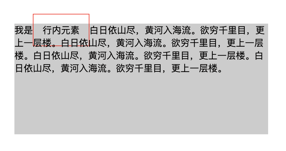
代码为,可见于 行内元素的 padding 与 margin - codepen(opens new window)
<div class="container">
  我是<span class="item">行内元素</span
  >白日依山尽,黄河入海流。欲穷千里目,更上一层楼。白日依山尽,黄河入海流。欲穷千里目,更上一层楼。白日依山尽,黄河入海流。欲穷千里目,更上一层楼。白日依山尽,黄河入海流。欲穷千里目,更上一层楼。
</div>
为 .item 行内元素设置样式,观察效果:
.item {
  padding: 1rem;
  border: 1px solid red;
}

.container {
  margin: 3rem;
  background-color: #ccc;
  height: 10rem;
}
Author
回答者: fariellany(opens new window)
inline 元素的 margin 与 padding 左右生效,上下不生效
不是 inline 下 margin 上下失效 ,padding 下 都生效吗 只不过不会撑大父元素而已
html 的默认 display 属性是多少
Issue
欢迎在 Gtihub Issue 中回答此问题: Issue 282(opens new window)
Author
回答者: fariellany(opens new window)
block
Author
内联元素: inline 块级元素: block
Author
回答者: shfshanyue(opens new window)
html 根元素的默认 display 为 block
响应式布局需要注意哪一些
Issue
欢迎在 Gtihub Issue 中回答此问题: Issue 283(opens new window)
Author
回答者: Innocentw(opens new window)
栅格布局?
Author
回答者: ZimTang(opens new window)
media-query 媒体查询 rem 相对长度单位,相对于 html 根元素 vw/vh 网页视口高度和宽度
对一个非定长宽的块状元素如何做垂直水平居中
Issue
欢迎在 Gtihub Issue 中回答此问题: Issue 284(opens new window)
Author
回答者: huxiamei(opens new window)
flex 布局
Author
回答者: XJHxjh0118(opens new window)
定位 .parent{ position: relative; } .child{ position: absolute; top: 50%; left: 50%; transform: translate(-50%, -50%); }
Author
回答者: linlai163(opens new window)
css position
 .container {
            position: relative;
        }
        .container .item {
            width: 100px;
            height: 50px;
            position: absolute;
            top: 0;
            left: 0;
            bottom: 0;
            right: 0;
            margin: auto;
        }
Author
回答者: shfshanyue(opens new window)
css position
.container {
            position: relative;
        }
        .container .item {
            width: 100px;
            height: 50px;
            position: absolute;
            top: 0;
            left: 0;
            bottom: 0;
            right: 0;
            margin: auto;
        }
非定宽了,你这个不行呀
Author
回答者: linlai163(opens new window)
css position
.container {
            position: relative;
        }
        .container .item {
            width: 100px;
            height: 50px;
            position: absolute;
            top: 0;
            left: 0;
            bottom: 0;
            right: 0;
            margin: auto;
        }
非定宽了,你这个不行呀
面试官说,做题前要好好读题。😭
Author
回答者: jkLennon(opens new window)
https://github.com/shfshanyue/Daily-Question/issues/10
如何实现左右固定,中间自适应布局
Issue
欢迎在 Gtihub Issue 中回答此问题: Issue 308(opens new window)
Author
回答者: shfshanyue(opens new window)
可以参考 【Q017】css 如何实现左侧固定 300px,右侧自适应的布局(opens new window)
.container
  .left
  .main
  .right
.container {
  display: flex;
}

.left {
  flex-basis: 300px;
  flex-shrink: 0;
}

.right {
  flex-basis: 300px;
  flex-shrink: 0;
}

.main {
  flex-grow: 1;
}
Author
回答者: Innocentw(opens new window)
.box {
display: flex
}

.left,.right {
width: 300px
}

.center {
flex: 1
}
Author
回答者: linlai163(opens new window)
以前还要用圣杯和双飞翼,现在都直接 flex 了。
Author
回答者: WangKang1555(opens new window)
 <div class="container">
        <div class="left"></div>
        <div class="main"></div>
        <div class="right"></div>
  </div>
<style>
    /* grid布局 */

    .container {
        height: 20rem;
        margin: 2rem;
        background-color: #eeeeee;
        display: grid;
        grid-template-columns: 300px 1fr 300px;
    }

    .left {
        height: 100%;
        border: 1px solid black;
    }

    .main {
        height: 100%;
    }

    .right {
        height: 100%;
        border: 1px solid;
    }
</style>
Author
回答者: YanCoeder1(opens new window)
楼上应该去掉 height
如何实现表格单双行条纹样式
Issue
欢迎在 Gtihub Issue 中回答此问题: Issue 309(opens new window)
Author
回答者: shfshanyue(opens new window)
通过 css3 中伪类 :nth-child 来实现。其中 :nth-child(an+b) 匹配下标 { an + b; n = 0, 1, 2, ...} 且结果为整数的子元素
nth-child(2n)/nth-child(even): 双行样式nth-child(2n+1)/nth-child(odd): 单行样式
其中 tr 在表格中代表行,实现表格中单双行样式就很简单了:
tr:nth-child(2n) {
  background-color: red;
}

tr:nth-child(2n + 1) {
  background-color: blue;
}
同理:
- 如何匹配最前三个子元素:
:nth-child(-n+3) - 如何匹配最后三个子元素:
:nth-last-child(-n+3)
简述下 css specificity
Issue
欢迎在 Gtihub Issue 中回答此问题: Issue 311(opens new window)
Author
回答者: shfshanyue(opens new window)
css specificity 即 css 中关于选择器的权重,以下三种类型的选择器依次下降
id选择器,如#appclass、attribute与pseudo-classes选择器,如.header、[type="radio"]与:hovertype标签选择器和伪元素选择器,如h1、p和::before
其中通配符选择器 *,组合选择器 + ~ >,否定伪类选择器 :not() 对优先级无影响
另有内联样式 <div class="foo" style="color: red;"></div> 及 !important(最高) 具有更高的权重
:not的优先级影响 - codepen(opens new window) 可以看出:not对选择器的优先级无任何影响CSS Specificity - codepen(opens new window) 可以看出十几个 class 选择器也没有一个 id 选择器权重高
'+' 与 '~' 选择器有什么不同
Issue
欢迎在 Gtihub Issue 中回答此问题: Issue 317(opens new window)
Author
回答者: shfshanyue(opens new window)
+选择器匹配紧邻的兄弟元素~选择器匹配随后的所有兄弟元素
有哪些 css 属性不能展示动画效果
Issue
欢迎在 Gtihub Issue 中回答此问题: Issue 319(opens new window)
Author
回答者: ZimTang(opens new window)
display,height css 不能在 display:none 和 display:block 之间进行动画,也不能在 height:0 和 height:auto 之间进行动画
css 动画与 js 动画哪个性能更好
Issue
欢迎在 Gtihub Issue 中回答此问题: Issue 321(opens new window)
Author
回答者: 1178518969(opens new window)
CSS3 的动画: 1.在性能上会稍微好一些,浏览器会对 CSS3 的动画做一些优化(比如专门新建一个图层用来跑动画) 2.代码相对简单 3.在动画控制上不够灵活 4.兼容性不好 5.部分动画功能无法实现(如滚动动画,视差滚动等) JavaScript 的动画: 正好弥补了 css 缺点,控制能力很强,可以单帧的控制、变换,同时写得好完全可以兼容 IE6,并且功能强大。 总结: 对于一些复杂控制的动画,使用 javascript 会比较好。而在实现一些小的交互动效的时候,可以多考虑 CSS
css 中属性选择器及类选择器的权重哪个高
Issue
欢迎在 Gtihub Issue 中回答此问题: Issue 323(opens new window)
Author
回答者: 1178518969(opens new window)
.box 权重是 10 ,div[class=box]权重可以看成 11 div .box 和 div[class=box]权重是一样的
Author
回答者: shfshanyue(opens new window)
参考 css specificity(opens new window),它俩选择器群众一样高
为什么会发生样式抖动
Issue
欢迎在 Gtihub Issue 中回答此问题: Issue 327(opens new window)
Author
回答者: caro1xxx(opens new window)
因为没有指定元素具体高度和宽度,比如数据还没有加载进来时元素高度是 100px(假设这里是 100px),数据加载进来后,因为有了数据,然后元素被撑大,所有出现了抖动
position: sticky 如何工作,适用于哪些场景
Issue
欢迎在 Gtihub Issue 中回答此问题: Issue 337(opens new window)
Author
回答者: shfshanyue(opens new window)
position: sticky 可理解为 relative 与 fixed 的结合体
Author
MDN 的解释:position: sticky 在正常文档流中仍然保有位置,然后会相对于它的最近的滚动祖先和最近的块级祖先根据 top, left, right, bottom 的值进行偏移。元素偏移不会影响其他任何元素的位置,因为会为该元素创建一个新的层叠上下文,从而不会影响到页面上的其他元素
css-tricks 一篇文章的理解:在窗口的管轮向下滚动没有让该元素完全消失前,该元素的表现就与 postion:relative 的元素相同,之后该元素的表现就类似于 position: fixed 的元素, 只不过该元素是相对于离他最近的滚轮祖先
Reference: Docs: https://developer.mozilla.org/zh-CN/docs/Web/CSS/position Code: https://css-tricks.com/almanac/properties/p/position/
什么是层叠上下文 (stacking contect),谈谈对它的理解
Issue
欢迎在 Gtihub Issue 中回答此问题: Issue 338(opens new window)
Author
回答者: Fengjing95(opens new window)
https://www.zhangxinxu.com/wordpress/2016/01/understand-css-stacking-context-order-z-index/
你用 css 实现过什么不错的效果
Issue
欢迎在 Gtihub Issue 中回答此问题: Issue 339(opens new window)
你做前端有多少时间花在写 css 上
Issue
欢迎在 Gtihub Issue 中回答此问题: Issue 340(opens new window)
Author
回答者: Innocentw(opens new window)
非常多
如果说是开发阶段,我会用 20%-30% 的时间写 CSS。
比你想象的时间更少?
- 我们开发的是一套内部的管理系统。
- 其中一个原因是在 UI 设计时遵循了 element-ui 的规范,而开发使用的 UI 框架为 element-ui,因此大多数的界面并不需要写大量的 CSS,因为预设样式已足够使用。
- 另外一个不得不提的原因是,针对业务场景,我们开发了一批公共组件,剩余的开发部分只需要对组件进行排列组合即可。
- 最后是,我们的系统对动效的要求不高,不需要花费大量时间去调整动效。
伪类与伪元素有什么区别
Issue
欢迎在 Gtihub Issue 中回答此问题: Issue 342(opens new window)
Author
回答者: shfshanyue(opens new window)
- 伪类使用单冒号,而伪元素使用双冒号。如
:hover是伪类,::before是伪元素 - 伪元素会在文档流生成一个新的元素,并且可以使用
content属性设置内容
参考 https://www.w3.org/TR/CSS2/selector.html#pseudo-elements(opens new window)
css 如何匹配前 N 个子元素及最后 N 个子元素
Issue
欢迎在 Gtihub Issue 中回答此问题: Issue 369(opens new window)
Author
回答者: shfshanyue(opens new window)
见 【Q307】如何实现表格单双行条纹样式(opens new window)
- 如何匹配最前三个子元素:
:nth-child(-n+3) - 如何匹配最后三个子元素:
:nth-last-child(-n+3)
如何使用 CSS 实现网站的暗黑模式 (Dark Mode)
更多描述
可参考以下文章:
Issue
欢迎在 Gtihub Issue 中回答此问题: Issue 375(opens new window)
Author
回答者: shfshanyue(opens new window)
@media (prefers-color-scheme: dark) {
  :root {
  }
}
Author
实现方式:
html[theme="dark-model"] {
  filter: invert(1) hue-rotate(180);
  transition: color 300ms, background-color 300ms; /*过渡动画*/
}
解释: css 的 filter 属性 是将用于图片上的过滤,颜色变化等图形效果应用与元素上, 上面所使用到的 invert 可以用来反转应用程序的颜色; hue-rotate 是用来改变图像上的应用色颜色 通过 invert(1)将白色变成黑色,那么为了适配颜色的变化,网页上的图像的颜色应该也做一个改变,这个改变就是通过 hue-rotate(180edg)来实现的 filter 属性 其他著名的应用还有: _ blur() 模糊图像 _ opacity() 图像透明程度 _ drop-shadow() 对图像应用阴影效果 _ ...
Reference
MDN Docs(opens new window) 如何实现网页 dark-model(opens new window)
介绍 CSS 隐藏页面中某个元素的几种方法
Issue
欢迎在 Gtihub Issue 中回答此问题: Issue 452(opens new window)
Author
CSS 方法一: display:none CSS 方法二: position:absolute;top:-1000px;left:-1000px;
Author
回答者: shfshanyue(opens new window)
更多的隐藏方案可查看: 10 Ways to Hide Elements in CSS(opens new window)
01 display: none
通过 CSS 操控 display,移出文档流
display: none;
02 opacity: 0
透明度为 0,仍在文档流中,当作用于其上的事件(如点击)仍有效
opacity: 0;
03 visibility: hidden
透明度为 0,仍在文档流中,但作用于其上的事件(如点击)无效,这也是 visibility:hidden 与 opacity: 0 的区别
visibility: hidden;
04 content-visibility
移出文档流,但是再次显示时消耗性能低
content-visibility: hidden;
05 绝对定位于当前页面的不可见位置
position: absolute;
top: -9000px;
left: -9000px;
06 字体大小设置为 0
font-size: 0;
css 如何实现响应式布局大屏幕三等分、中屏幕二等分、小屏幕一等分
Issue
欢迎在 Gtihub Issue 中回答此问题: Issue 473(opens new window)
Author
回答者: shfshanyue(opens new window)
页面布局元素如下,item 数量不固定
<div class="container">
  <div class="item"></div>
  <div class="item"></div>
  <div class="item"></div>
  <div class="item"></div>
  <div class="item"></div>
  <div class="item"></div>
</div>
使用 Grid 布局可以轻松解决这个问题,如若使用其它方案,控制好等分的同时再控制好间距也是一个十分头疼的问题:
grid-template-columns: 控制等分gap: 控制间隙
效果可见 codepen(opens new window)
@media (min-width: 768px) {
  .container {
    grid-template-columns: repeat(2, minmax(0, 1fr));
  }
}

@media (min-width: 1024px) {
  .container {
    grid-template-columns: repeat(3, minmax(0, 1fr));
  }
}

.container {
  display: grid;
}

.conainer {
  gap: 1rem;
}
TailwindCSS 是一款非常方便的 CSS 原子类框架,只需要一行即可搞定
<div class="grid grid-cols-1 md:grid-cols-2 lg:grid-cols-3 gap-4"></div>
但是这就够了吗?
这远远不够,这也足够复杂!
- 需要媒体查询
- 需要人为设置 breakpoint,设置大小屏幕的边界
终极解决方案
Grid 布局可以自动判断容器大小,无论大小屏幕自动撑满并均分,请看以下属性
.container {
  grid-template-columns: repeat(auto-fill, minmax(300px, 1fr));
}
repeat: 用以 N 整分auto-fill:表示自动填充minmx: 即书面意思,最小宽度为300px
使用终极解决方案的在线页面(opens new window)
Author
回答者: qiutian00(opens new window)
终极解决方案 正好在用。
Author
页面布局元素如下,item 数量不固定
<div class="container">
  <div class="item"></div>
  <div class="item"></div>
  <div class="item"></div>
  <div class="item"></div>
  <div class="item"></div>
  <div class="item"></div>
</div>
使用 Grid 布局可以轻松解决这个问题,如若使用其它方案,控制好等分的同时再控制好间距也是一个十分头疼的问题:
grid-template-columns: 控制等分gap: 控制间隙效果可见 codepen(opens new window)
``` @media (min-width: 768px) { .container { grid-template-columns: repeat(2, minmax(0, 1fr)); } }
@media (min-width: 1024px) { .container { grid-template-columns: repeat(3, minmax(0, 1fr)); } }
.container { display: grid; }
.conainer { gap: 1rem; } ```
TailwindCSS是一款非常方便的 CSS 原子类框架,只需要一行即可搞定
<div class="grid grid-cols-1 md:grid-cols-2 lg:grid-cols-3 gap-4"></div>但是这就够了吗?
这远远不够,这也足够复杂!
- 需要媒体查询
- 需要人为设置 breakpoint,设置大小屏幕的边界
终极解决方案
Grid布局可以自动判断容器大小,无论大小屏幕自动撑满并均分,请看以下属性
.container {
  grid-template-columns: repeat(auto-fill, minmax(300px, 1fr));
}
repeat: 用以 N 整分auto-fill:表示自动填充minmx: 即书面意思,最小宽度为300px
链接跳过去是图标大全
Author
回答者: shfshanyue(opens new window)
@nmsn 这是效果,查看源码即可
前端开发中如何进行多主题配置
Issue
欢迎在 Gtihub Issue 中回答此问题: Issue 476(opens new window)
如何自定义滚动条的样式
Issue
欢迎在 Gtihub Issue 中回答此问题: Issue 479(opens new window)
Author
回答者: shfshanyue(opens new window)
滚动条相关样式都是伪元素,以 scrollbar 打头,有以下伪元素,从 -webkit 中可见兼容性一般,不过无所谓,现在 Chrome 浏览器占大头
::-webkit-scrollbar— 整个滚动条.::-webkit-scrollbar-button— 滚动条上的按钮 (上下箭头).::-webkit-scrollbar-thumb— 滚动条上的滚动滑块.::-webkit-scrollbar-track— 滚动条轨道.::-webkit-scrollbar-track-piece— 滚动条没有滑块的轨道部分.::-webkit-scrollbar-corner— 当同时有垂直滚动条和水平滚动条时交汇的部分.::-webkit-resizer— 某些元素的 corner 部分的部分样式(例:textarea 的可拖动按钮).
但其实最常用的是以下几个伪元素:滚动条、滑块、轨道,如下滚动条设置成功
::-webkit-scrollbar {
  width: 6px;
  height: 6px;
}

::-webkit-scrollbar-track {
  border-radius: 3px;
  background: rgba(0, 0, 0);
  box-shadow: inset 0 0 5px rgba(0, 0, 0, 0.08);
}

::-webkit-scrollbar-thumb {
  border-radius: 3px;
  background: rgba(0, 0, 1);
  box-shadow: inset 0 0 10px rgba(0, 0, 0, 0.2);
}
如何实现容器中子元素三个三列布局,子元素两个则两列布局
更多描述
及容器中有三个及以上元素,则三列布局 容器只有两个元素,两列布局平分 容器只有一个元素,一列布局全占
Issue
欢迎在 Gtihub Issue 中回答此问题: Issue 486(opens new window)
Author
css 布局阔以使用flex,grid.
关健在于如何判断有多少元素。我们只需要判断有 1 个,有 2 个的情况,其他都是三列布局
/* 有1个元素 */
.item:nth-last-child(1):first-child {
  flex: 1;
}

.item:nth-last-child(1):first-child ~ .item {
  flex: 1;
}

/* 有2个元素 */
.item:nth-last-child(2):first-child {
  flex: 1;
}

.item:nth-last-child(2):first-child ~ .item {
  flex: 1;
}
Author
反过来,前 3 个设置flex:1,超过 3 个就重置为none
/*前3个flex:1*/
.item:nth-child(-n + 3) {
  flex: 1;
}

/*超过3个则none*/
.item:nth-last-child(4),
.item:nth-last-child(4) ~ .item {
  flex: none;
}
网站设置字体时,如何设置优先使用系统默认字体
Issue
欢迎在 Gtihub Issue 中回答此问题: Issue 489(opens new window)
Author
回答者: shfshanyue(opens new window)
font-family: system-ui;
system-ui 将会自动选取系统默认字体作为字体,如 bootstrap 的样式规则(opens new window)
$font-family-sans-serif: system-ui, -apple-system, "Segoe UI", Roboto, "Helvetica Neue",
  Arial, "Noto Sans", "Liberation Sans", sans-serif, "Apple Color Emoji", "Segoe UI Emoji",
  "Segoe UI Symbol", "Noto Color Emoji" !default;
写 CSS 时如何避免命名样式冲突
Issue
欢迎在 Gtihub Issue 中回答此问题: Issue 493(opens new window)
Author
回答者: shfshanyue(opens new window)
1. BEM 式: .home-page .home-page-btn
.home-page {
  .home-page-btn {
  }
}
BEM 有一个缺点,就是有些太长,可适当简化,只包裹该页面组件的根类名,但有可能增加样式冲突的风险
.home-page {
  .btn {
  }
}
2. CSS Scoped
scoped css 会对当前组件(scope)下所有元素生成唯一的属性或类名,对所有 CSS 规则将携带唯一属性实现作用域的命名保护
// 手动写
.btn {
}

// 编译后
.btn .jsx-1287234 {
}
3. CSS Module
module css 会对类名进行 hash 化
CSS 如何设置方格背景
Issue
欢迎在 Gtihub Issue 中回答此问题: Issue 501(opens new window)
Author
回答者: mrrs878(opens new window)
background: linear-gradient(90deg, rgba(200, 200, 200, 0.1) 3%, transparent 0),
  linear-gradient(rgba(200, 200, 200, 0.1) 3%, transparent 0);
background-size: 20px 20px;

如何更好地给元素设置 z-index
Issue
欢迎在 Gtihub Issue 中回答此问题: Issue 505(opens new window)
画一个 100x100 的方框,其中文字可以正常换行,文字过多超过方框显示滚动条
Issue
欢迎在 Gtihub Issue 中回答此问题: Issue 514(opens new window)
Author
回答者: hwb2017(opens new window)
主要使用 word-wrap: break-word 或 break-all 和 overflow: scroll 实现
Grid 布局如何实现类似 flex: row-reverse
Issue
欢迎在 Gtihub Issue 中回答此问题: Issue 518(opens new window)
Author
通过 grid-auto-flow 属性 和 direction 属性 来实现 grid 布局类似 flex: row-reverse 的样式
grid-auto-flow: [row | column] || dense 该属性指定采用 grid 布局的容器内部的元素如何排序 direction: rtl | ltr 指定文本, 表列的水平方向
Reference
MDN(opens new window) Article(opens new window)
HTML 标签有哪些行内元素
Issue
欢迎在 Gtihub Issue 中回答此问题: Issue 529(opens new window)
Author
回答者: shfshanyue(opens new window)
常见的标签有以下几种,可参考 inline element(opens new window)
- a
- img
- picture
- span
- input
- textarea
- select
- label
CSS 如何设置一行超出显示省略号
Issue
欢迎在 Gtihub Issue 中回答此问题: Issue 530(opens new window)
Author
回答者: shfshanyue(opens new window)
overflow: hidden;
text-overflow: ellipsis;
white-space: nowrap;
CSS 如何设置多行超出显示省略号
Issue
欢迎在 Gtihub Issue 中回答此问题: Issue 531(opens new window)
Author
回答者: shfshanyue(opens new window)
使用 -webkit-line-clamp 来设置多行超出显示省略号
overflow: hidden;
display: -webkit-box;
-webkit-box-orient: vertical;
-webkit-line-clamp: 2;
flex 布局中 order 有何作用
Issue
欢迎在 Gtihub Issue 中回答此问题: Issue 538(opens new window)
Author
回答者: shfshanyue(opens new window)
order 属性定义 Flex 布局中子元素的排列顺序,数值越小,排列越靠前,默认为 0。
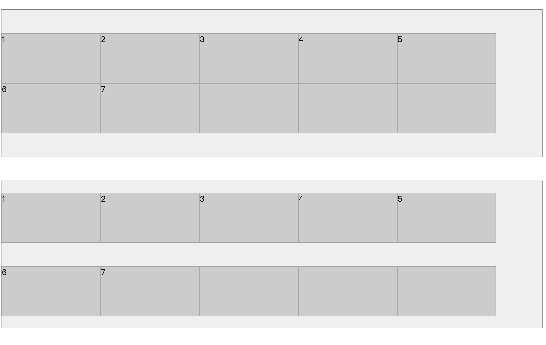
flex 布局中 align-content 与 align-items 有何区别
Issue
欢迎在 Gtihub Issue 中回答此问题: Issue 539(opens new window)
Author
回答者: shfshanyue(opens new window)
align-content作用于纵轴多行元素,一行元素不起作用align-items作用于纵轴单行元素
下图,上部分为 align-content,下部分为 align-items
子元素垂直居中,并且该正方形的长度/宽度为父容器宽度(width)一半的正方形
Issue
欢迎在 Gtihub Issue 中回答此问题: Issue 544(opens new window)
Author
回答者: shfshanyue(opens new window)
<div class="container">
  <div class="item"></div>
</div>
以前采用百分比撑高 padding,那这种方案已经过时,会挤压 Content 内容,无法在其中填充内容(需要绝对定位)。
可使用最新的属性 aspect-ratio,即长宽比
.container {
  display: grid;
  place-items: center;
}

.item {
  width: 50%;
  aspect-ratio: 1/1;
}
简述 css 中 position 的值
Issue
欢迎在 Gtihub Issue 中回答此问题: Issue 545(opens new window)
Author
回答者: shfshanyue(opens new window)
static: 默认值,无定位,top、right、bottom、left不起任何作用relative: 相对定位absolute: 绝对定位,脱离文档流,上下左右以最近的定位父元素为参照系fixed: 脱离文档流,上下左右以浏览器视口为参照系sticky:relative与fixed的结合体
什么是 BFC
更多描述
- 它是如何生成的
- 它有什么作用及应用
Issue
欢迎在 Gtihub Issue 中回答此问题: Issue 546(opens new window)
Author
回答者: shfshanyue(opens new window)
块级格式化上下文,Block Formatting Context
Author
回答者: hwb2017(opens new window)
参考思否上的这篇 前端面试题-BFC(块格式化上下文) (opens new window)
CSS 如何实现固定长宽比的元素
Issue
欢迎在 Gtihub Issue 中回答此问题: Issue 547(opens new window)
Author
回答者: shfshanyue(opens new window)
过去的解决方案是使用 padding。一个元素的 padding 如若设置为百分比,则代表的是以父元素宽度为基准,根据这个原理,可设置长宽比。但实际上意义有限,毕竟你把 padding 给占了,content 无任何区域。
现代化的解决方案是使用长宽比的 CSS 属性: aspect-ratio
Author
回答者: hwb2017(opens new window)
codepen demo(opens new window)
另外 aspect-ratio 也可以用于媒体查询中,参考 mdn(opens new window)
rem、em、vw、vh 的值各是什么意思
Issue
欢迎在 Gtihub Issue 中回答此问题: Issue 548(opens new window)
Author
回答者: shfshanyue(opens new window)
他们同属于 CSS Data Type 中的 [length],见文档 length - MDN(opens new window)
rem: 根据根元素(即html)的font-sizeem: 根据自身元素的font-sizevw: viewport widthvh: viewport height
normalize.css 与 reset.css 又何区别
Issue
欢迎在 Gtihub Issue 中回答此问题: Issue 549(opens new window)
Author
回答者: shfshanyue(opens new window)
What is the difference between Normalize.css and Reset CSS?(opens new window)
- normalize.css(opens new window): 会保留有用的样式,比如 h1 的字体大小
- reset.css(opens new window): 把所有样式都重置,比如 h1、h2、h3 的字体大小都进行了重置,保持了无样式
Author
回答者: linlai163(opens new window)
那普通项目是哪一个更好使? 我倾向 reset.css。
line-height 的值分别取 [2, 2em, 200%] 有什么区别?
Issue
欢迎在 Gtihub Issue 中回答此问题: Issue 550(opens new window)
Author
回答者: shfshanyue(opens new window)
line-height 是相对于元素自身的字体大小来取值,但同时会被继承。在实际工作中,取值 2em 或者 200% 有可能遇到未预测的内容。
比如:
- 父元素:
fontSize: 18px; lineHeight: 1.5em(27px,150% 同理);,它的 lineHeight 计算下来为 27px,会被子元素继承 - 子元素:
fontSize: 30px,子元素的 lineHeight 被继承为 27px,出现问题
以下为演示代码,见: lineHeight - codepen(opens new window)
<div class="box green">
  <h1>lineHeight: 1.5; 这是没有问题的框框</h1>
  lineHeight: 1.5; 这是没有问题的框框 lineHeight: 1.5; 这是没有问题的框框
</div>

<div class="box red">
  <h1>lineHeight: 1.5em; 这是有问题的框框</h1>
  lineHeight: 1.5em; 这是有问题的框框 lineHeight: 1.5em; 这是有问题的框框
</div>

<div class="box orange">
  <h1>lineHeight: 150%; 这是有问题的框框</h1>
  lineHeight: 150%; 这是有问题的框框 lineHeight: 150%; 这是有问题的框框
</div>
.green {
  line-height: 1.5;
  border: solid limegreen;
}

.red {
  line-height: 1.5em;
  border: solid red;
}

.orange {
  line-height: 150%;
  border: solid orange;
}

h1 {
  font-size: 30px;
}

.box {
  width: 18em;
  display: inline-block;
  vertical-align: top;
  font-size: 16px;
}
某元素的 fontSize: 2rem; lineHeight: 1.5em; 此时 lineHeight 为多少像素
Issue
欢迎在 Gtihub Issue 中回答此问题: Issue 561(opens new window)
Author
回答者: HunterXing(opens new window)
font-size: 2rem. ----> 则该元素默认情况下,font-size: 32px line-height: 1.5em, em 相对于自身元素的 font-size, 则 line-height: 1.5 * 32 === 48px
Grid 布局的优势在哪里
Issue
欢迎在 Gtihub Issue 中回答此问题: Issue 567(opens new window)
Author
回答者: Kiera569(opens new window)
Flex 布局是轴线布局,只能指定"项目"针对轴线的位置,可以看作是一维布局。 Grid 布局则是将容器划分成"行"和"列",产生单元格,然后指定"项目所在"的单元格,可以看作是二维布局。 Grid 布局远比 Flex 布局强大
Author
回答者: shfshanyue(opens new window)
响应式!
如何实现三列均分布局
更多描述
布局代码如下所示,可见 三列均分布局 - codepen(opens new window)
注: 在第一个元素中设置文字,子元素不能因文字过长而挤压。
<div class="container">
  <div class="item">白日依山尽,黄河入海流。欲穷千里目,更上一层楼。</div>
  <div class="item"></div>
  <div class="item"></div>
</div>
// 以下为样式代码,非核心功能代码
* {
  box-sizing: border-box;
}

.container {
  background-color: #eee;
  height: 10rem;
  width: 40rem;
  margin: 1rem;
}

.item {
  border: 1px solid #888;
}
Issue
欢迎在 Gtihub Issue 中回答此问题: Issue 572(opens new window)
Author
回答者: shfshanyue(opens new window)
见代码 三均分布局 - Codepen(opens new window)
使用 Flex
注意使用 calc(100% / 3) 设置 flex-basis,同时它的缺陷是不能够很好的为子元素设置左右间隙
.flex-container {
  display: flex;
  flex-wrap: wrap;
  // gap: 1rem;

  .item {
    flex: 0 0 calc(100% / 3);
  }
}
注意: 如果同时给子元素使用
flex-grow: 1控制均分,当子元素拥有文字等内容时,会受到挤压,将无法实现均分布局。
使用 Grid
使用 Grid 直接操作容器即可,对于子元素之间的间隙也可以很好地控制,可看出 Grid 更为简单,更为高效,更为精确
.grid-container {
  display: grid;
  grid-template-columns: 1fr 1fr 1fr;
  gap: 1rem;
}
什么是媒体查询,JS 可以监听媒体查询吗
Issue
欢迎在 Gtihub Issue 中回答此问题: Issue 578(opens new window)
Author
回答者: haotie1990(opens new window)
MediaQueryList(opens new window)
Author
回答者: shfshanyue(opens new window)
TODO
z-index: 999 元素一定会置于 z-index: 0 元素之上吗
Issue
欢迎在 Gtihub Issue 中回答此问题: Issue 579(opens new window)
Author
回答者: shfshanyue(opens new window)
代码见 zindex - codepen(opens new window)
不可,更复杂的示例见 层叠上下文 - MDN(opens new window)
请简介 CSS 的盒模型
Issue
欢迎在 Gtihub Issue 中回答此问题: Issue 626(opens new window)
Author
回答者: linlai163(opens new window)
- 标准盒模型 width = content-width height = content-height
- 怪异盒模型 width = content-width + padding + border height = content-height + padding + border
但是我感觉怪异盒模型更好用 😂
CSS 有哪些选择器
Issue
欢迎在 Gtihub Issue 中回答此问题: Issue 638(opens new window)
Author
回答者: shfshanyue(opens new window)
:hover:active:first-child:last-child:nth-child:first-of-type:last-of-type:nth-of-type:empty:check:disable
CSS 有哪些伪类与伪元素选择器
Issue
欢迎在 Gtihub Issue 中回答此问题: Issue 639(opens new window)
Author
回答者: shfshanyue(opens new window)
CSS 选择器 - MDN(opens new window)
伪元素
::before::after::selection::placeholder::marker
伪类
:hover:first-child:last-child:nth-child
Author
回答者: haotie1990(opens new window)
| 选择器 | 例子 | 例子描述 |
|---|---|---|
| :active | a:active | 选择活动的链接。 |
| :checked | input:checked | 选择每个被选中的 元素。 |
| :disabled | input:disabled | 选择每个被禁用的 元素。 |
| :empty | p:empty | 选择没有子元素的每个元素。 |
| :enabled | input:enabled | 选择每个已启用的 元素。 |
| :first-child | p:first-child | 选择作为其父的首个子元素的每个元素。 |
| :first-of-type | p:first-of-type | 选择作为其父的首个元素的每个元素。 |
| :focus | input:focus | 选择获得焦点的 元素。 |
| :hover | a:hover | 选择鼠标悬停其上的链接。 |
| :in-range | input:in-range | 选择具有指定范围内的值的 元素。 |
| :invalid | input:invalid | 选择所有具有无效值的 元素。 |
| :lang(language) | p:lang(it) | 选择每个 lang 属性值以 "it" 开头的元素。 |
| :last-child | p:last-child | 选择作为其父的最后一个子元素的每个元素。 |
| :last-of-type | p:last-of-type | 选择作为其父的最后一个元素的每个元素。 |
| :link | a:link | 选择所有未被访问的链接。 |
| :not(selector) | :not(p) | 选择每个非元素的元素。 |
| :nth-child(n) | p:nth-child(2) | 选择作为其父的第二个子元素的每个元素。 |
| :nth-last-child(n) | p:nth-last-child(2) | 选择作为父的第二个子元素的每个元素,从最后一个子元素计数。 |
| :nth-last-of-type(n) | p:nth-last-of-type(2) | 选择作为父的第二个元素的每个元素,从最后一个子元素计数 |
| :nth-of-type(n) | p:nth-of-type(2) | 选择作为其父的第二个元素的每个元素。 |
| :only-of-type | p:only-of-type | 选择作为其父的唯一元素的每个元素。 |
| :only-child | p:only-child | 选择作为其父的唯一子元素的元素。 |
| :optional | input:optional | 选择不带 "required" 属性的 元素。 |
| :out-of-range | input:out-of-range | 选择值在指定范围之外的 元素。 |
| :read-only | input:read-only | 选择指定了 "readonly" 属性的 元素。 |
| :read-write | input:read-write | 选择不带 "readonly" 属性的 元素。 |
| :required | input:required | 选择指定了 "required" 属性的 元素。 |
| :root | root | 选择元素的根元素。 |
| :target | #news:target | 选择当前活动的 #news 元素(单击包含该锚名称的 URL)。 |
| :valid | input:valid | 选择所有具有有效值的 元素。 |
| :visited | a:visited | 选择所有已访问的链接。 |
css 加载会阻塞 DOM 树的解析和渲染吗
Issue
欢迎在 Gtihub Issue 中回答此问题: Issue 672(opens new window)
Author
回答者: shfshanyue(opens new window)
TODO
Author
回答者: hwb2017(opens new window)
css 加载会直接影响网页的渲染,因为只有 css 加载完毕,构建完 CSSOM 后,渲染树(Render Tree)才会构建,然后渲染成位图
如果 html 中有加载 script 的话,还会间接影响 DOM 树的解析,因为 javascript 的下载、解析和执行和阻塞 DOM 树的解析,而 javascript 中有可能访问 CSSOM,比如 Element.getBoundingClientRect,因此 CSSOM 构建完毕以后才会开始 javascript 的执行,间接阻塞 dom 树的解析
在 CSS 中,使用 rem 作为单位有何缺点
Issue
欢迎在 Gtihub Issue 中回答此问题: Issue 687(opens new window)
Author
回答者: illumi520(opens new window)
1.a11y 可访问性不友好,不跟随系统字体
Author
回答者: shfshanyue(opens new window)
TODO
Author
回答者: heretic-G(opens new window)
不支持 iframe 而且有一个理念问题 大屏是为了更大更清晰还是为了承载更多内容
其实这也是现在很多舍弃 rem 的原因 1:1 还原之后 你希望 pad 也和手机一样? 大屏手机也和普通手机一样? 这个我觉得你体验过其实会发现这里其实不是一个好的展示逻辑
还有一个找到的 但是没有实际踩过得坑 就是在很高的高倍屏上 rem 会有展示问题 但是我没遇到过...
Flex 布局中的 flex-basis 与 width 有何区别
Issue
欢迎在 Gtihub Issue 中回答此问题: Issue 716(opens new window)
Author
回答者: shfshanyue(opens new window)
- 当
flex-direction为column时,主轴为纵轴,此时flex-basis与height对应 flex-basis的值为理想情况,而在实际情况中可能被压缩
